Color Contrast Enhancement (CCE) was a silver retention process used at Deluxe Laboratories in the late 1990s that provided an extreme gritty look, with a muted color palette and increased contrast. Its companion process, Adjustable Contrast Enhancement (ACE), allowed for scalable control of contrast and black levels without impairing color saturation.
Film Explorer
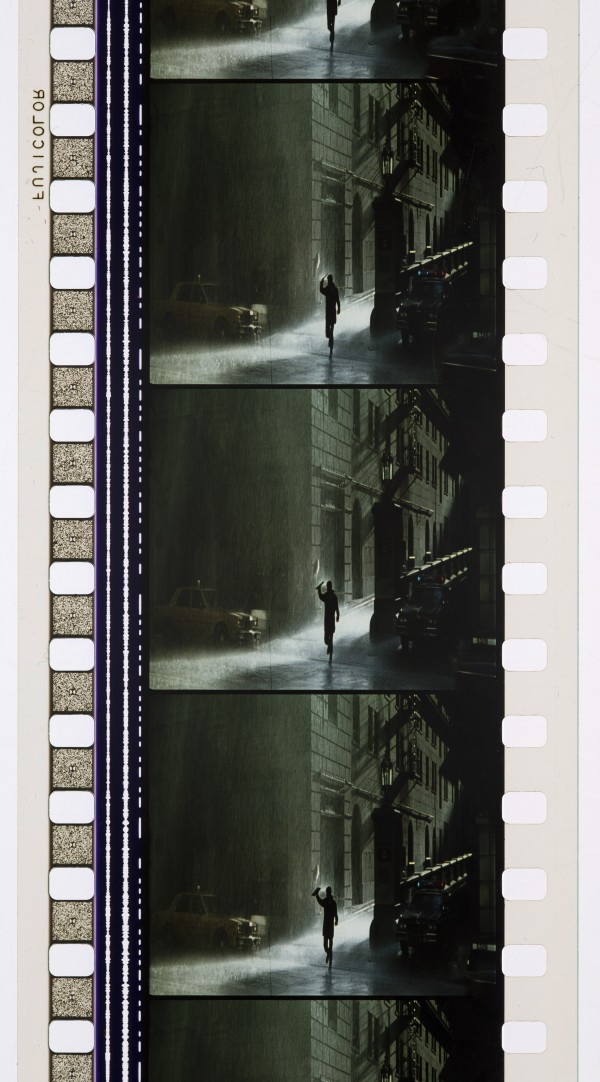
On David Fincher’s Se7en (1995), a small number of 35mm show prints were made for big city engagements using Deluxe’s Color Contrast Enhancement silver retention process. This enhanced the film’s noirish visual style with heightened contrast, desaturated colors and rich blacks.
Martin Scorsese Collection, George Eastman Museum, Rochester, NY, United States.
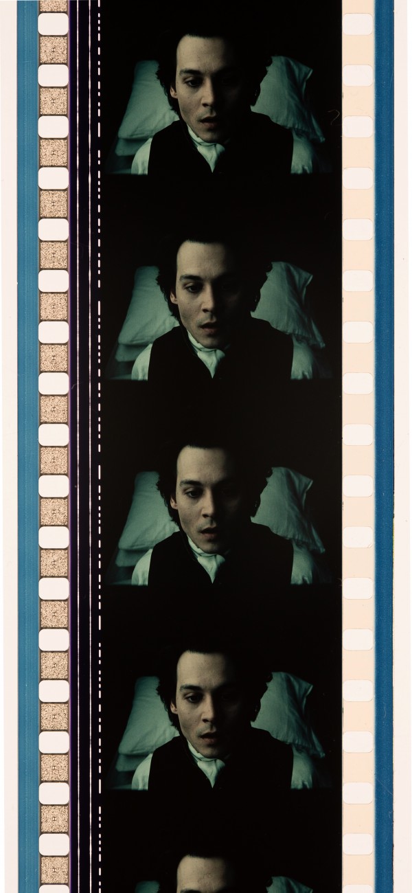
The entire US print run of Sleepy Hollow (1999) was made using the CCE process. Director Tim Burton wanted a stark monochromatic look that resembled old illustrations.
George Eastman Museum, Rochester, NY, United States.
Identification
Varied
The CCE and ACE processes were typically applied to film prints. Instead of removing silver particles from the color dye layers, as in standard processing, prints made using CCE retained 75 per cent of the original silver content in the emulsion, offering higher tonal contrast and notably muted colors, when compared to standard prints. Prints produced with ACE retained 30–60 per cent of original silver content in the emulsion – offering higher contrast in comparison to standard prints, without muting color saturation. Both Eastman Kodak and Fuji release print stocks were used.
1
CCE prints have more muted colors compared to standard prints, while ACE prints retain most of the original saturation. The color designs of sets and costumes had to be carefully considered, and tested, in order to obtain good exposure and detail in the resulting CCE prints.
Varied
Standard color negative. Most features released with CCE prints were photographed on Eastman EXR, or Vision 2, negative products – some used Fujicolor negative.
History
I still clearly remember the day in 1995, when director David Fincher and cinematographer Darius Khondji walked into Deluxe Laboratories, where I was vice president of technical services, and stated they wanted to achieve a special “look” for their new film, Se7en (1995).
Khondji had previously employed bleach-bypass techniques, at the Eclair and LTC laboratories in Paris, on two cinematographic collaborations with Jean-Pierre Jeunet and Marc Caro – on Delicatessen (1991) and La Cité des enfants perdus (1995). On Se7en, Khondji was looking to create a radical modern “color noir” visual aesthetic: “I wanted to use the silver process and push the stock to get a feeling of grittiness,” he later recalled. “David was after an image that was dark, darker and darker still. Very black – but distinctive enough to be able to see the detail within the black. We loved the noir films of the ’40s and ’50s, but that kind of photography had only been achieved in black and white – never in color.” (Williams, 1995; Weinstein, 2023) At Deluxe, I worked with Colin Mossman, executive vice president of engineering to perfect an existing silver retention technique that we eventually called Color Contrast Enhancement (CCE), which had not been used on a film through all stages of production before – from dailies to release prints. This process left 75 per cent, or more, of the original silver in the print rather than removing it entirely, as you would normally do – effectively overlaying a B/W image on top of the color print.
There had always been the desire among creatives in the industry, to create something unique for their film images. After Technicolor debuted its ENR silver retention process for Warren Beatty’s Reds in 1981, many laboratories embarked on promoting “special looks” that could be created in post-production. Consolidated Film Industries had Silver Tint, Fotokem had Skip-Bleach, LTC had Noir en Couleur, to name a few, and Deluxe had CCE. Since smooth production and scalable capacity were always an issue when manufacturing release prints, Deluxe needed a process that was practical, and easy for the facility to accomplish – CCE offered that because we simply modified one stage of the standard color processing workflow.
Although CCE was applied to release prints, its use had to be factored in across all stages of production – from production design and costuming, to photography and lighting. It produced a much higher contrast and added grain to the film image, with blacks becoming much stronger. If lighting and exposure were not carefully controlled it was easy to “plug-up” the blacks and lose detail in the shadows. Tones were more muted and nuances in the grays were diminished. As a result, the process was not kind to faces, creating a harsh look.
After the success of Se7en, many clients came to Deluxe seeking similar results and we made release prints for multiple films using CCE, including Tim Burton’s Sleepy Hollow (1999), which was one of the largest releases consisting entirely of silver-retention prints. The cinematographer, Emmanuel Lubezki was fascinated with this look and would return to do many silver-retention films with us.
On Sleepy Hollow, as Lubezki recounted to Stephen Pizzello in American Cinematographer, Tim Burton wanted a monochromatic look that resembled old engraved and lithographic illustrations, with shades of grey, dark blue, very dark brown and green. “He asked me if there was anything I could do in the photography to get that look, so we began talking with Beverly [Wood] about different processes that would enhance the film's contrast and desaturate the colors. We did a bunch of tests, like flashing and not flashing the film, and we decided to go with CCE, which was the process that would add the most contrast and desaturate the colors the most. Tim was always there when we did the process tests. It was a lot of fun to have him there, and we liked the same things, so we went with the CCE process.” (Pizzello, 1999)
“Once we decided on the look, we had a meeting with all of the departments, because CCE really affects the contrast and blacks in the images,” Lubezki continued. “Ian Robinson was our contact at Deluxe London, and we consulted very closely with him. The costume designer, Colleen Atwood, was doing a lot of stuff in black, but after the tests she began adding bits of silver and other enhancements to the texture of the clothes so we wouldn't lose the details completely. With Rick Heinrichs, we would paint 8' by 4's [8 ft x 4 ft (2.44m x 1.22m) flats] with the colors he was planning to use for each set, and then shoot them, project the footage, discuss it and revise the colors. The color red was particularly affected by the process, it became really dark, sometimes so dark that it was almost black. We had to be really careful in the way we lit things. If you went into one of our sets while we were shooting, you'd have thought we were doing a soap opera, because everything looked really overlit. When we saw the dailies, though, everyone would say, 'Wow, this is really dark and moody.' You always have to factor in the effect that the [post-production] process will have on the images. The first week of the show was miserable for me, and many many times I wanted to kill myself for deciding to work with the CCE process, but when you see the movie from start to finish, it looks really good." (Pizzello, 1999)
In the late 1990s, in consultation with cinematographers, I realized that Deluxe needed to offer another silver retention process that was more adaptable. We were in constant competition with Technicolor’s ENR process, which could be manipulated to different degrees, so we developed our equivalent process, Adjustable Contrast Enhancement, or ACE. The ACE process gave filmmakers deep blacks without affecting the colors as harshly. We were able to give clients 30, 40 or 60 per cent silver retention, or whatever level they wanted. Unlike CCE, ACE prints had a good level of color saturation and texture in the mid-scale regions. We could make specific nuances in the image with scalable chemical changes in the processing.
Among the first ACE releases was Jean-Pierre Jeunet’s Alien: Resurrection (1997) which had its dailies and answer print made at Technicolor using the ENR process, but because of a contractual obligation, all release prints were made by Deluxe. Jeunet compared Deluxe’s ACE check print with his ENR answer print from Technicolor and was “quite happy with the result”. (Probst, 1998)
Like so many things in the film business, creativity gave way to time and ease of release. As the number of release prints ordered by the big studios increased during the 1990s and early 2000s – sometimes up to 10,000 prints for a tentpole day-and-date, simultaneous worldwide release – the ability to coordinate the release with special processing became difficult. Studios were supportive of the extra cost, but getting the prints made and shipped on time was essential.
The birth of digital intermediate workflows also gave filmmakers the ability to digitally color correct images, control the look easily and in a multitude of new ways, including emulating silver retention techniques.
By the early 2000s, digital color grading was becoming standard industry practice, however some filmmakers still wanted to achieve the CCE, or ACE, look. On Lemony Snicket’s A Series of Unfortunate Events (2004), cinematographer Emmanuel Lubezki used the Adjustable Contrast Adjustment process on the film’s 35mm dailies in order to “fine tune the visual tenor of the film” and “create a rock-solid visual reference” that could be followed during the digital intermediate. Lubezki explained: “I used Deluxe’s CCE process on Sleepy Hollow to desaturate colors, but the ACE process is more controllable. […] We used it to desaturate colors, but not all the colors.” (Williams, 2004) After completing a series of tests, Lubezki and Deluxe settled on using a 50-percent ACE process on the film dailies. I supplied the digital colorist at EFilm with curves from the ACE dailies, which could then be replicated in the digital domain.
Quentin Tarantino’s Django Unchained (2012) used the same workflow for the Western part of the story. A 50% application of ACE was applied to the print dailies, while a digital approximation of this look was applied for the final grade. The film’s cinematographer Robert Richardson outlined the goal:
“The creative intention was to create a desaturated look with deeper blacks. When Django and Shultz travel to the South, ACE was dropped, and the result was an apparent increase in chroma [saturation]. In the digital realm, Yvan [Lucas, the colorist] added a 15-percent desaturation [in the color grading software] and an increase in contrast to mimic the look of ACE, but there is no way to fully replicate the chemical properties of the process digitally.” (Marcks, 2013)
Even powerful digital tools cannot replace the unique visual qualities of a silver image on the print in the projector with light shining through.
Selected Filmography
Photographed by Darius Khondji. 3,000 prints were made with 50% ACE.
Photographed by Darius Khondji. 3,000 prints were made with 50% ACE.
Photographed by Michael Seresin. ACE
Photographed by Michael Seresin. ACE
Photographed by Harris Savides. CCE
Photographed by Harris Savides. CCE
Photographed by Ericson Core. Began production intending to use the CCE process, and dailies were printed with CCE, but the film eventually went through digital intermediate and color timing to recreate the CCE look.
Photographed by Ericson Core. Began production intending to use the CCE process, and dailies were printed with CCE, but the film eventually went through digital intermediate and color timing to recreate the CCE look.
Photographed by Robert Richardson. ACE dailies only.
Photographed by Robert Richardson. ACE dailies only.
A two-part television mini-series. A few prints were made using CCE.
A two-part television mini-series. A few prints were made using CCE.
Photographed by Emmanuel Lubezki. ACE
Photographed by Emmanuel Lubezki. ACE
Photographed by Emmanuel Lubezki. ACE dailies only.
Photographed by Emmanuel Lubezki. ACE dailies only.
Photographed by Mauro Fiore. CCE
Photographed by Mauro Fiore. CCE
Photographed by Ericson Core. CCE
Photographed by Ericson Core. CCE
Photographed by Robert Fraisse. A select number of CCE showprints were made.
Photographed by Robert Fraisse. A select number of CCE showprints were made.
Photographed by Darius Khondji. A small number of first-run prints were made using CCE.
Photographed by Darius Khondji. A small number of first-run prints were made using CCE.
Photographed by Janusz Kaminski. Most release prints were made using Technicolor’s ENR process, however Deluxe made some CCE prints for international territories, such as Japan.
Photographed by Janusz Kaminski. Most release prints were made using Technicolor’s ENR process, however Deluxe made some CCE prints for international territories, such as Japan.
Photographed by Emmanuel Lubezki. The entire print run was released using CCE.
Photographed by Emmanuel Lubezki. The entire print run was released using CCE.
Photographed by Robert Richardson. ACE
Photographed by Robert Richardson. ACE
Photographed by Ward Russell. 3,000 prints were made with 50% ACE.
Photographed by Ward Russell. 3,000 prints were made with 50% ACE.
Technology
Normally when color film is developed, the fixer first converts the unexposed and undeveloped silver halide in the emulsion to soluble, complex silver thiosulfate compounds that are removed in this fixer and the subsequent wash. An accelerator prepares the remaining metallic silver for bleaching. The bleach then converts the metallic silver from the picture image, formed during color development, to silver-halide compounds that can be removed by a second fixer, and then a final wash removes residual bleach from the film. Thus, in typical color film processing, most of the silver is removed and the image is reproduced primarily using colored dyes.
In the 1990s, Deluxe Laboratories offered three silver retention processes: full bleach-bypass (where 100 per cent of the silver remained), Color Contrast Enhancement (or CCE, where approximately 75 per cent of the silver remained), and Adjustable Contrast Enhancement (or ACE, where approximately 30–60 per cent of the silver remained). For Color Contrast Enhancement, we simply replaced the accelerator chemicals with water, just prior to the bleaching stage, lowering the ability of the bleach to act on the silver, resulting in a color image with more silver than usual.
As I explained to American Cinematographer in 1998:
“When you keep 100 per cent of the silver in [with a full bleach-bypass], the blacks look great in the dark parts of the room, but the faces now also have a lot of silver in them as well, so their contrast is all messed up. The fleshtones may look old and hard; therefore, you may say, ‘Can I back off on the amount of silver in my print and still keep some of the normal nuances of the curve?' What this basically means is that you should try to make only the top part of the curve increase, while you keep the toe area the same. To do that, we back off from skip bleach and go to CCE. [...] What you will then see on the screen is that you now have some nice desaturation in the color; there's still a little bit of grittiness and grain to it, but you'll have more detail in the blacks than if you just skipped the bleach. For a movie like Se7en, where the lighting was predominately on the upper part of the curve because the whole movie was so dark, going with CCE was one of the reasons that film looked so good.” (Probst, 1998)
ACE was similar to Technicolor’s ENR process. We added a B/W developer after the bleaching, but prior to the final fix, so that the silver could be re-developed in the film and add density to the black and desaturate the colors. With this process, a varying amount of B/W developer results in a varying amount of desaturation and contrast. This allowed the image to simply be “kissed” by the technique or “pushed” into a more intense look. Another key variable is the way the film was shot and exposed. While no one wanted to underexpose a film, it was very interesting what could be achieved using variable exposure as a tool, in conjunction with the ACE process.
As with all silver retention processes, we used infrared (IR) readings to monitor and control the process, and check for consistency of outcomes. A normal print’s control patch read at 55 IR, while a CCE print reads 180 IR. IR readings for ACE prints could fall anywhere between 120 IR and 150 IR. For reference, a print with 100 per cent silver retention reads at 240 IR. On many occasions, when a feature that had been graded and processed elsewhere came to Deluxe for release prints – two examples being Alien: Resurrection (1997) and Saving Private Ryan (1998) – we would simply read the IR on the other laboratory’s answer print and match our output reading to match their’s through the concentration of B/W developer used. Occasionally, the IR of the other lab’s answer print was up at the 180 level – we found that we could easily match these using CCE.
With the added cost of making silver retention release prints, not all films could have all of the release prints done this way. With Se7en, only a small number of show prints were made with CCE, so we also perfected the ability to “build-in” the look of the retention by adding silver and flashing at the interpositive/internegative stage. This resulted in release prints that could be made using the normal process. This method retained a similar grain structure and desaturation as CCE prints, but the blacks were not as strong.
There were occasions when a client would want to see the difference between CCE and ACE before a production had started. Using film clips from Kodak, I created a demonstration reel that compared NORMAL, CCE and ACE. These prints were screened in a room using two projectors in tandem, and prospective clients would be able to flip between the two options to compare the processes.
CCE and ACE processing was available at Deluxe’s Hollywood, Toronto and London labs, but it was primarily carried out in Hollywood, so as to avoid interrupting the other labs’ processing setups. At Deluxe in Hollywood, we installed various push-button controls that would enable the machine to process a silver retention print. With ACE, a button could be pushed and the tank with the B/W developer would be fed through the machine for the print. This was a much better solution than having to drop tanks and wash out the film in order to prepare for an ACE run.
References
Calhoun, John (2003). “Heavy Metal”. American Cinematographer, 84:8 (August). https://theasc.com/magazine/aug03/cover/sidebar.html
Marcks, Iain (2013). “Django Unchained: Once Upon a Time in the South”. American Cinematographer , 94:1 (January): pp. 32–49. https://theasc.com/articles/django-unchained-richardson-tarantino
Pizzello, Stephen (1999). “Galloping Ghost: Sleepy Hollow”. American Cinematographer, 80:12 (December). https://theasc.com/articles/flashback-sleepy-hollow
Probst, Christopher (1998). “Soup Du Jour”. American Cinematographer, 79:11 (November): p. 82. https://theasc.com/magazine/nov98/soupdujour/index.htm
Williams, David E. (1995). “Seven: Sins of a Serial Killer”. American Cinematographer, 76:10 (October). https://theasc.com/articles/flashback-seven-1995
Williams, David E. (2004). “A Darker Side of Fantasy”. American Cinematographer, 85:12 (December). https://theasc.com/magazine/dec04/lemony/page1.html
Patents
None
Compare
Related entries
Author
Beverly Wood, former Executive Vice-President, Technical Services, Deluxe/E-Film, 1993–2015, held a BSc in Chemistry and an MSc in Analytical Chemistry. Beverly worked at Kodak for 9 years, where she supported cinematographers, and she was active in the ASC and the Academy of Motion Picture Arts and Sciences (AMPAS). Her greatest achievement was receiving the Natalie and Herbert T. Kalmus Medal, in 2020, from the Society of Motion Picture and Television Engineers, after her retirement from the industry.
Wood, Beverly (2024). “Deluxe Color Contrast Enhancement”. In James Layton (ed.), Film Atlas. www.filmatlas.com. Brussels: International Federation of Film Archives / Rochester, NY: George Eastman Museum.