A manually applied color process, developed in the 1890s, as a means of dyeing a length of B/W film a specific color.
Film Explorer
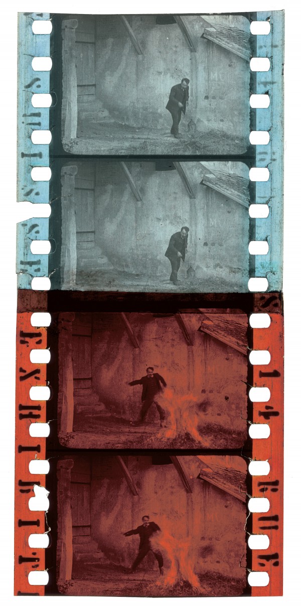
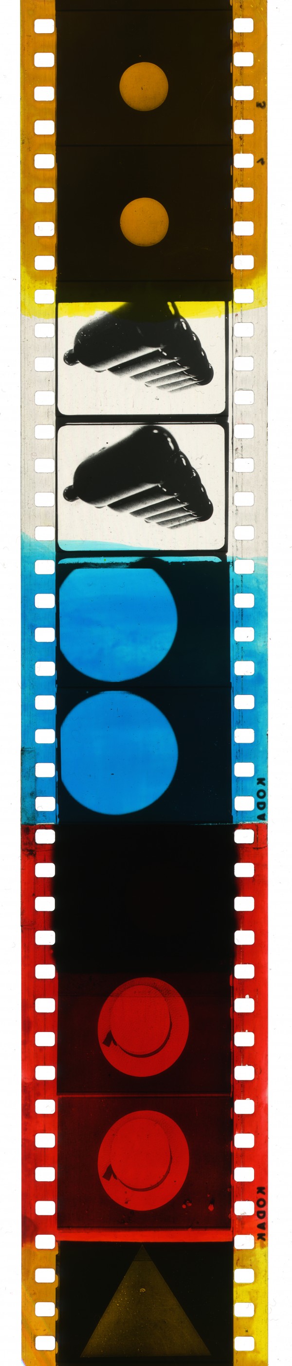
Two tint colors from Le Contremaître incendiaire (1907), joined by a splice at the moment a nocturnal arsonist, initially tinted blue, starts a fire – with a corresponding cut to red tinting.
Davide Turconi Collection, George Eastman Museum, Rochester, NY, United States.
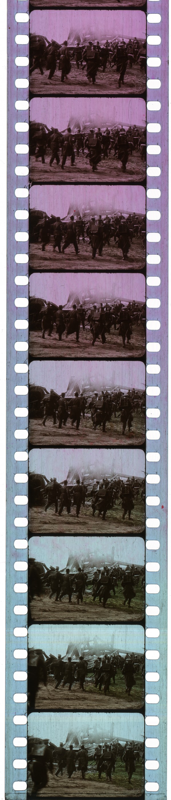
In this shot from Maudite soit la guerre (1914), the tinting gradually changes across several frames and is combined with stencil coloring. The effect was probably achieved by means of manually adjusting the dye composition of the tinting solution as the positive print was passed through it.
EYE Filmmuseum, Amsterdam, Netherlands.
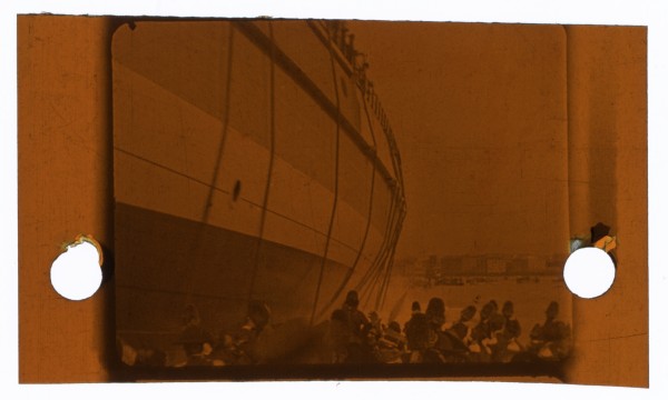
Steamship Leaving Dock in New York Harbor (1896), on a tinted base stock by Lumière.
Film Frame Collection, Seaver Center for Western History Research, Natural History Museum of Los Angeles County, Los Angeles, CA, United States.
Sequence tinted by brush in various hues, from the Netherlands Filmliga print of Ballet mécanique (Fernand Léger & Dudley Murphy, France, 1924).
EYE Filmmuseum, Amsterdam, Netherlands.
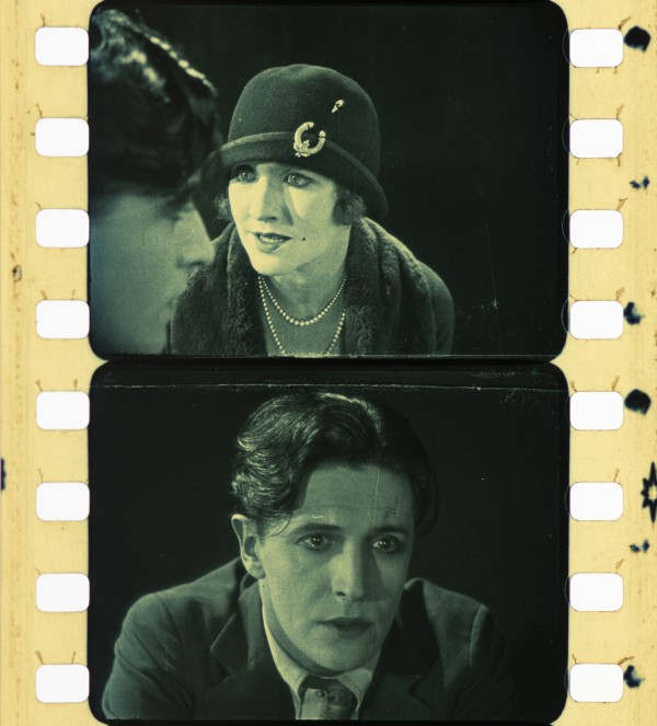
A scene tinted amber and toned blue, from a nitrate print of The Lodger: A Story of the London Fog (Alfred Hitchcock, United Kingdom, 1927).
BFI National Archive. Photographs of the tinted-and-toned nitrate print, from 1926, by Olivia Kristina Stutz, ERC Advanced Grant FilmColor, courtesy of the Timeline of Historical Film Colors. https://www.filmatlas.com/entry/451
Identification
35mm primarily (used on most gauges).
B/W, at times combined with toning, stenciling and/or hand-coloring. The colored dye was absorbed into the gelatin emulsion layer, producing a uniform color across the B/W image. Alternatively, pre-tinted stocks had color applied to the base side of the film.
Any B/W print stock could be tinted – as a result, a wide variety of film stock manufacturer markings can be found on tinted prints.
1
A variety of hues were available for tinting: sometimes identified, quite baldly, by names such as “Cine Red”, “Cine Yellow” and “Cine Blue”. At other times tints were marketed much more evocatively, with colors such as “Canary Yellow”, “Fire Red”, “Grass Green”. Sonochrome pre-tinted stock from Eastman Kodak went as far as, “Verdante”, “Afterglow” and “Purplehaze”.
New versions of pretinted film stocks were developed at the end of the 1920s to avoid interference with the soundtrack. See Sonochrome.
History
Tinting was the most prevalent, and affordable, applied coloring process used around the world during the silent era. The process was in use from the mid-1890s – with Lumière examples identified from 1896 – and it remained an ongoing (if minor) practice even beyond the advent of sound-on-film, in the 1920s, and well into the twentieth century.
Tinting applies a uniform color across the full width of the filmstrip, encompassing the entire image. At times, it was used in combination with other coloring techniques – toning, hand coloring, stenciling – to create multicolored images. Initially, the technique was an outgrowth of nineteenth-century tinted theatrical lighting: colored gels, called “tinters”, were inserted in front of stage lights, to achieve both diegetic and mood effects. Gel tinters were also used on lantern slide projection lenses and subsequently on film projectors, to add changing color as a live element of exhibition. As film tinting became more standardized, it was applied onto the positive film strip itself, through the application of translucent, aniline dyes that are absorbed into the emulsion of B/W prints providing a uniform display of color across the frame for the duration of a shot, scene, or sequence, and occasionally for the duration of an entire film. It was deployed on most modes of film, from fiction to nonfiction to animation and even stag films.
The uses and “language” of film tinting were various. Worldwide, there exist culturally prescribed “meanings” assigned to colors – and these meanings vary widely, from culture to culture, for any given color. Sometimes, for the same film, the tints used on international distribution prints differed from those distributed domestically. While tinting guidelines, in the form of “frame slugs” inserted into printing negatives at the head of sequences, provided suggestions, printing and coloring labs had relative flexibility in the choice of tints for their particular region of distribution. Sometimes film tinting was used in coded ways to provide diegetic meanings to sequences; at other times tinting corresponded more literally, if loosely, to the presumed diegetic colors of a scene. Perhaps the most commonly recurring tints used in this way were blue (for night) and red (for fire). In an example from a scene in the Pathé film Le Contremaître incendiaire (1907), a disgruntled foreman at a film studio tries to disguise his theft of money from the company’s safe by burning down the studio. Under the cover of night – tinted blue – he sneaks outside of one of the buildings and douses some nearby straw with a flammable liquid. At the moment he throws a lighted lamp onto the pile, the blue tinting cuts to a deep red. Similar diegetic uses of color abound, particularly in association with illumination at night. In a Duskes film from 1910, Wildschützenrache (A Poacher’s Revenge), the poacher lights a candle inside his house, and as he does so, the film cuts from a blue to a yellow-amber tint – approximating the hue of candlelight. Brighter yellow tints could be used diagetically for sunny, outdoor scenes; green was used, with some frequency, for woodsy, bucolic settings.
Throughout the silent era, in more nuanced forms of codification, color tints were also used for sensational, mood-inducing effects. In one of the earliest published accounts of film tinting, Animated Pictures, author C. Francis Jenkins relates how “[c]olors for projection are washed upon blank strips suitable for reproduction”, in order to create effects for “the eye which music does through the ear” (Jenkins, 1898). Such abstracted conceptions of the uses of tinting were widespread and diverse, encompassing an appreciation of the synaesthetic interrelations between the senses of color and sound; abstract practices of color music; and generalized ideas about the mood-inducing effects of color, in which color tints were employed to underscore the emotional truth of a scene, much in the way of a musical score. Thus, a blue tint might convey not only the low lighting of a scene, but also connote the chill of night; a bright yellow tint might indicate sunlight, while also communicating warmth, both diagetic and emotional. Red tinting might be used to reinforce passionate themes and events. The most calibrated attempt to codify such nuanced meanings is seen with the Sonochrome line of film stocks, introduced by Eastman Kodak in 1928. These pre-tinted stocks were designed to be used with sound-on-film prints – the tints were specifically designed to preserve the fidelity of optical sound tracks. The promotional material also claimed that the colors of the tints were, further, “keyed to the moods on the screen… Sonochrome colors have definite affective values. Some excite, some tranquilize, some repress. Properly used, they enhance the moods of the screen and aid the powers of reproductive imagination in the observer, without making a distinct impression on the consciousness.” Although potentially subjective and, by-and-large, culturally determined, the affective power of film tinting was commonly promoted throughout the years of widespread use.
The use of tinting had diminished greatly by the end of the 1920s, mostly as a result of technological changes that rendered the process both problematic and increasingly redundant. Developments such as: the widespread adoption of synchronous sound; the increasing availability of photographic color systems; and, finally, panchromatic emulsions that made tinting look as if it belonged to a bygone era. And yet, tinting has never fully disappeared from cinema. Its occasional use continued for several more decades in the mainstream and it has lived on through use in a variety of artisanal and experimental films – such as Joseph Cornell’s Rose Hobart (1936), which Cornell initially projected through blue-colored glass, to tint it during exhibition; Joyce Wieland’s Hand Tinting (1968); and Tacita Dean’s Film (2011), to cite just a few examples.
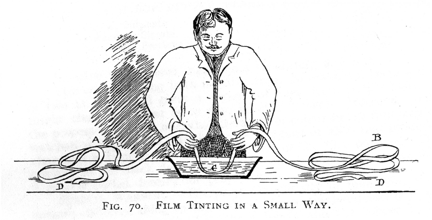
Small-batch tinting.
Bennett, Colin N. (1913). The Handbook of Kinematography. London: Kinematograph Society.
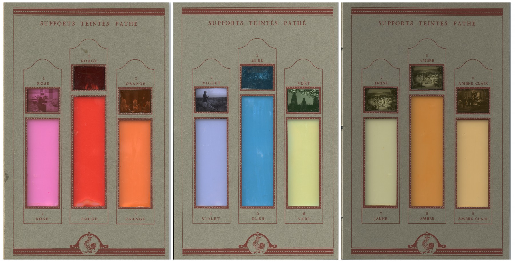
“Supports teintés Pathé”, tint samples from a Pathé frères’ brochure (c. 1925).
Cinémathèque française, Paris, France.
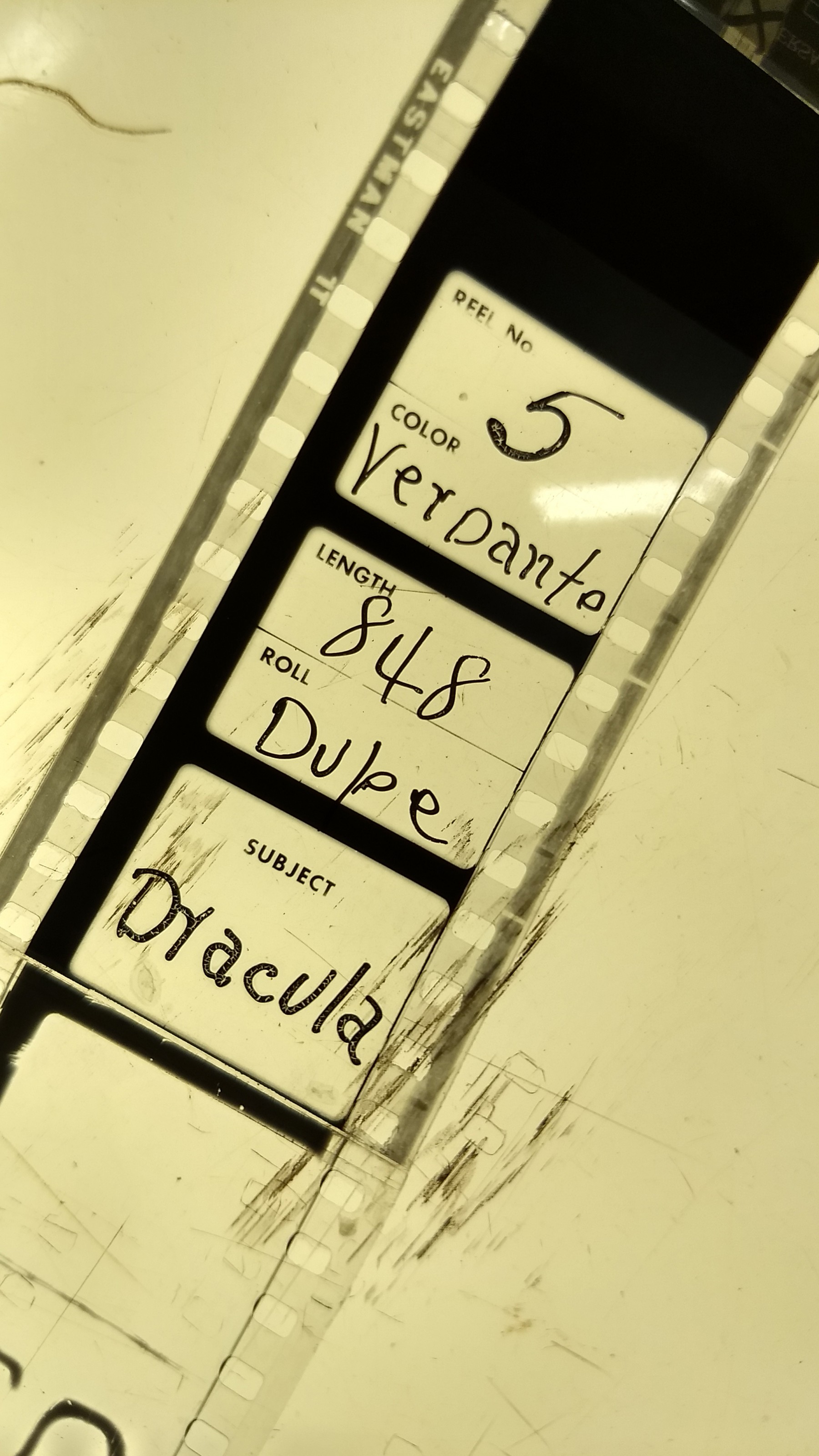
Frame slug from Dracula (1931), photographed from original picture negative edited into continuity.
Courtesy of the Library of Congress National Audio-Visual Conservation Center, Culpeper, VA, United States. Photograph by Abbey Taylor.
Selected Filmography
The EYE Filmmuseum collection contains an original, hand-tinted nitrate print of this hallmark of 1920s avant-garde cinema, which derives from the collections of the Netherlands Filmliga – the Dutch cine-club founded in 1927. Brush strokes and manual blending can be seen in the hand-tinted sequences of the print, which are used primarily (though not exclusively) for the abstract geometric shapes in the film.
The EYE Filmmuseum collection contains an original, hand-tinted nitrate print of this hallmark of 1920s avant-garde cinema, which derives from the collections of the Netherlands Filmliga – the Dutch cine-club founded in 1927. Brush strokes and manual blending can be seen in the hand-tinted sequences of the print, which are used primarily (though not exclusively) for the abstract geometric shapes in the film.
As with many examples of Weimar cinema, Das Cabinet des Dr. Caligari was elaborately tinted and toned when released. As Barbara Flueckiger has documented, through collaborative research project, DIASTOR: Bridging the Gap Between Analog Film History and Digital Technology, the film is colored differently across the surviving original print record from the 1920s, depending on when the print was processed and if it was intended for the domestic or international market.
As with many examples of Weimar cinema, Das Cabinet des Dr. Caligari was elaborately tinted and toned when released. As Barbara Flueckiger has documented, through collaborative research project, DIASTOR: Bridging the Gap Between Analog Film History and Digital Technology, the film is colored differently across the surviving original print record from the 1920s, depending on when the print was processed and if it was intended for the domestic or international market.
Provides a spectacular example of narrative use of tinting: a disgruntled foreman robs his employer, a film production studio, at night, and to hide the theft he resorts to arson – tossing kerosine followed by a flaming lamp on to a pile of straw next to one of the studio buildings. The scene is initially tinted blue, for night, until the lamp sets off the conflagration, at which point the tint abruptly cuts to red.
Provides a spectacular example of narrative use of tinting: a disgruntled foreman robs his employer, a film production studio, at night, and to hide the theft he resorts to arson – tossing kerosine followed by a flaming lamp on to a pile of straw next to one of the studio buildings. The scene is initially tinted blue, for night, until the lamp sets off the conflagration, at which point the tint abruptly cuts to red.
Though all contemporary safety prints of Dracula are B/W, it is likely that the film originally included green-tinted sequences, in its release in 1931. One of the original cutting continuities calls for scenes in Dracula’s castle to be tinted blueish-green; and a surviving, original-picture duplicate negative at the Library of Congress contains slugs with tinting information, calling for the use of Sonochrome “Verdante” green on reels five through eight. However, it is unclear from the Library of Congress print when these slugs date to – potentially added at a later date to spruce up the film for a rerelease.
Though all contemporary safety prints of Dracula are B/W, it is likely that the film originally included green-tinted sequences, in its release in 1931. One of the original cutting continuities calls for scenes in Dracula’s castle to be tinted blueish-green; and a surviving, original-picture duplicate negative at the Library of Congress contains slugs with tinting information, calling for the use of Sonochrome “Verdante” green on reels five through eight. However, it is unclear from the Library of Congress print when these slugs date to – potentially added at a later date to spruce up the film for a rerelease.
Italian cinema of the 1910s is recognized worldwide, as playing a significant role in the development of early feature filmmaking. Many of these pioneering epic works – most famously Giovanni Pastrone’s Cabiria (Itala Films, 1914) – were elaborately tinted and toned, as was also the case with Gli ultimi giorni di Pompei (1913). The film was brought to the United States by George Kleine who, to protect copyright, filed frame selections from the film with the Library of Congress – a common practice at the time. Luckily for us, these filings have preserved some of the elaborate tinted sequences in the film (see Timeline of Historical Film Colors by Barbara Flueckiger, https://filmcolors.org/galleries/gli-ultimi-giorni-di-pompei-1913/).
Italian cinema of the 1910s is recognized worldwide, as playing a significant role in the development of early feature filmmaking. Many of these pioneering epic works – most famously Giovanni Pastrone’s Cabiria (Itala Films, 1914) – were elaborately tinted and toned, as was also the case with Gli ultimi giorni di Pompei (1913). The film was brought to the United States by George Kleine who, to protect copyright, filed frame selections from the film with the Library of Congress – a common practice at the time. Luckily for us, these filings have preserved some of the elaborate tinted sequences in the film (see Timeline of Historical Film Colors by Barbara Flueckiger, https://filmcolors.org/galleries/gli-ultimi-giorni-di-pompei-1913/).
The Canadian artist and filmmaker Joyce Wieland made this structuralist, found-footage film from outtakes of an aborted US training documentary made for the Job Corps. The footage features a number of women, primarily African American, in West Virginia, who are seen socializing, dancing and swimming. She intercut their looping movements with black leader, embellished with abstract needle puncture patterns; and then hand-tinted the entire film with dyes she had on-hand, used for the textile artworks that also formed part of her art practice. (Elder, 2006: p. 261).
The Canadian artist and filmmaker Joyce Wieland made this structuralist, found-footage film from outtakes of an aborted US training documentary made for the Job Corps. The footage features a number of women, primarily African American, in West Virginia, who are seen socializing, dancing and swimming. She intercut their looping movements with black leader, embellished with abstract needle puncture patterns; and then hand-tinted the entire film with dyes she had on-hand, used for the textile artworks that also formed part of her art practice. (Elder, 2006: p. 261).
Tinted and toned throughout much of the film, one of the high points of L’Herbier’s famous L’Inhumaine is its explosive conclusion, in which he rapidly intercut tinted laboratory experiments with pure flashes of tinted colors. As he described the montage: “at certain moments of excitement, I inserted fragments of film stock of different colors, so that suddenly you seemed struck by flashes of pure white, and two seconds later, flashes of red, or blue, before the image reappeared” (Quoted in Abel, 1987: p. 392). While no original nitrate print of the film survives, Lobster Films was able to reconstruct many of the tinted sequences, referencing extant frame slugs that carried tinting instructions.
Tinted and toned throughout much of the film, one of the high points of L’Herbier’s famous L’Inhumaine is its explosive conclusion, in which he rapidly intercut tinted laboratory experiments with pure flashes of tinted colors. As he described the montage: “at certain moments of excitement, I inserted fragments of film stock of different colors, so that suddenly you seemed struck by flashes of pure white, and two seconds later, flashes of red, or blue, before the image reappeared” (Quoted in Abel, 1987: p. 392). While no original nitrate print of the film survives, Lobster Films was able to reconstruct many of the tinted sequences, referencing extant frame slugs that carried tinting instructions.
Tinting and toning was used to great effect in Hitchcock’s late silent film, to heighten the ambient terror that infuses the film. The film’s mix of gaslit interiors and foggy exteriors were largely rendered in blues and ambers. The negative of the film does not survive, but the British Film Institute, working in partnership with Deluxe 142, was able to restore the film in 2012, using surviving colored nitrate prints that were both tinted and toned.
Tinting and toning was used to great effect in Hitchcock’s late silent film, to heighten the ambient terror that infuses the film. The film’s mix of gaslit interiors and foggy exteriors were largely rendered in blues and ambers. The negative of the film does not survive, but the British Film Institute, working in partnership with Deluxe 142, was able to restore the film in 2012, using surviving colored nitrate prints that were both tinted and toned.
In a pivotal scene, thieves are about to break into an isolated telegraph station to steal payroll money. The unarmed, but quick thinking, operator (Blanche Sweet) picks up a wrench – holding it like a pistol – and turns the lights off. The image, which had been B/W, cuts to a blue tint signifying the darkness into which the room is plunged. After the thieves enter, she tricks them with a ruse and holds them off until help arrives.
In a pivotal scene, thieves are about to break into an isolated telegraph station to steal payroll money. The unarmed, but quick thinking, operator (Blanche Sweet) picks up a wrench – holding it like a pistol – and turns the lights off. The image, which had been B/W, cuts to a blue tint signifying the darkness into which the room is plunged. After the thieves enter, she tricks them with a ruse and holds them off until help arrives.
A remarkable colored film from the 1910s, directed by Machin for the Pathé affiliate, Belge-Cinéma-Film. The print preserved at the EYE Filmmuseum contains tinting, toning and stenciling – often layered on top of each other – for much of its runtime. It contains a sequence in which the tint was manually shifted during the coloring process, producing a smooth change from one hue to another – to enhance the effects of an on-screen explosion.
A remarkable colored film from the 1910s, directed by Machin for the Pathé affiliate, Belge-Cinéma-Film. The print preserved at the EYE Filmmuseum contains tinting, toning and stenciling – often layered on top of each other – for much of its runtime. It contains a sequence in which the tint was manually shifted during the coloring process, producing a smooth change from one hue to another – to enhance the effects of an on-screen explosion.
Technology
Techniques for tinting changed significantly over time. Early tinting evolved from the use of gel tinters in front of projection lenses to alter the color of the image onscreen. When tints began to be applied directly to positive film prints, technicians at first used brushes to apply hues to the entire frame, rather than to details within the scene. Subsequently, colorists tinted prints by immersion of the film in vats of aniline dye – this both was quicker, and also resulted in a more uniform color distribution across the frame. This dye immersion process could be carried out in small batches, by running a length of the print by hand through a bowl filled with dye, or, as was more common, in large processing vats, which enabled tinting of longer sequences. By the 1920s, companies such as Pathé, Kodak and Gevaert began producing pre-tinted, positive film stocks, so that B/W negatives could be printed directly onto tinted stocks, thus avoiding the need for additional lab work. Elaborate tinting guidebooks were also provided, which sought to market their proprietary hues.
As with most applied processes, tinting was often combined on film with other coloring techniques to sometimes dazzling effect: it was often used with toning to create two-color effects, as well as with stenciling and hand-coloring. Tints usually persisted for a select duration of a film (a shot, scene, or sequence): splices would allow for a cut to a new tinted hue, or back to B/W. However, tints could also be manually adjusted during the tinting process, so that the hues would transform gradually during a sequence. As an example, in Alfred Machin’s Maudite soit la guerre (1913) during a climactic battle sequence, a windmill where an enemy soldier is sheltering, is blown up. As the explosion bursts onscreen, the film cuts from a blue tint (with stenciled details) to a red tint. In the following shot, as soldiers rush in, the hues gradually transition from red to purple, and then back to the blue tint with stenciling, with no splices (Yumibe, 2012, pp. 130–131). Given the labor and care required to produce such effects, this type of transition was relatively rare.
From the 1910s onwards, tinting became increasingly standardized as part of the film editing process. Negatives for printing would be cut into tinting order, rather than narrative continuity order, so that sequences of the same color could be tinted in one go, then separated and re-spliced into continuity order. A complex lab system developed around this practice, in which shots and sequences would be identified with preceding frame “slugs” that identified the footage content, as well as any tinting and color processing that was required. These slugs cross-referenced with tinting and continuity guides, provided for each film, detailing the lab work necessary to print, color, and edit positive release prints – all requiring a significant investment of time and labor. Tinting slugs and continuity guides often varied in degree of complexity between those negatives intended for domestic or international distribution – usually simplifying the range of tints on international prints. The need for a greater number of splices, in cutting tinted prints back into continuity, was one of the contributory factors to the decline of tinting with the adoption of sound-on-film at the end of the 1920s. Splices interfered with the optical soundtracks, creating “pops” at each splice – in addition, the tints themselves could interfere with the light transmission of optical soundtracks. However, Kodak did develop its specifically designed Sonochrome pre-tinted stocks to diminish the light transmission issue, and tinting persisted as a minor practice for several more decades (L’Abbate, 2013).
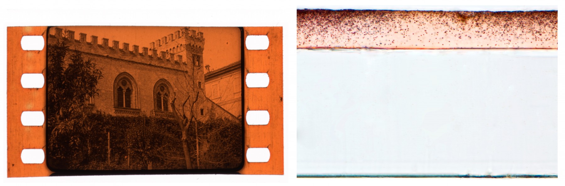
Left: Unidentified tinted sample from the early 1920s.
Right: Enlarged cross-section showing black silver particles suspended in the exposed gelatin emulsion layer (tinted orange), on top of the clear nitrate film base.
Image Permanence Institute / George Eastman Museum, Rochester, NY, United States.
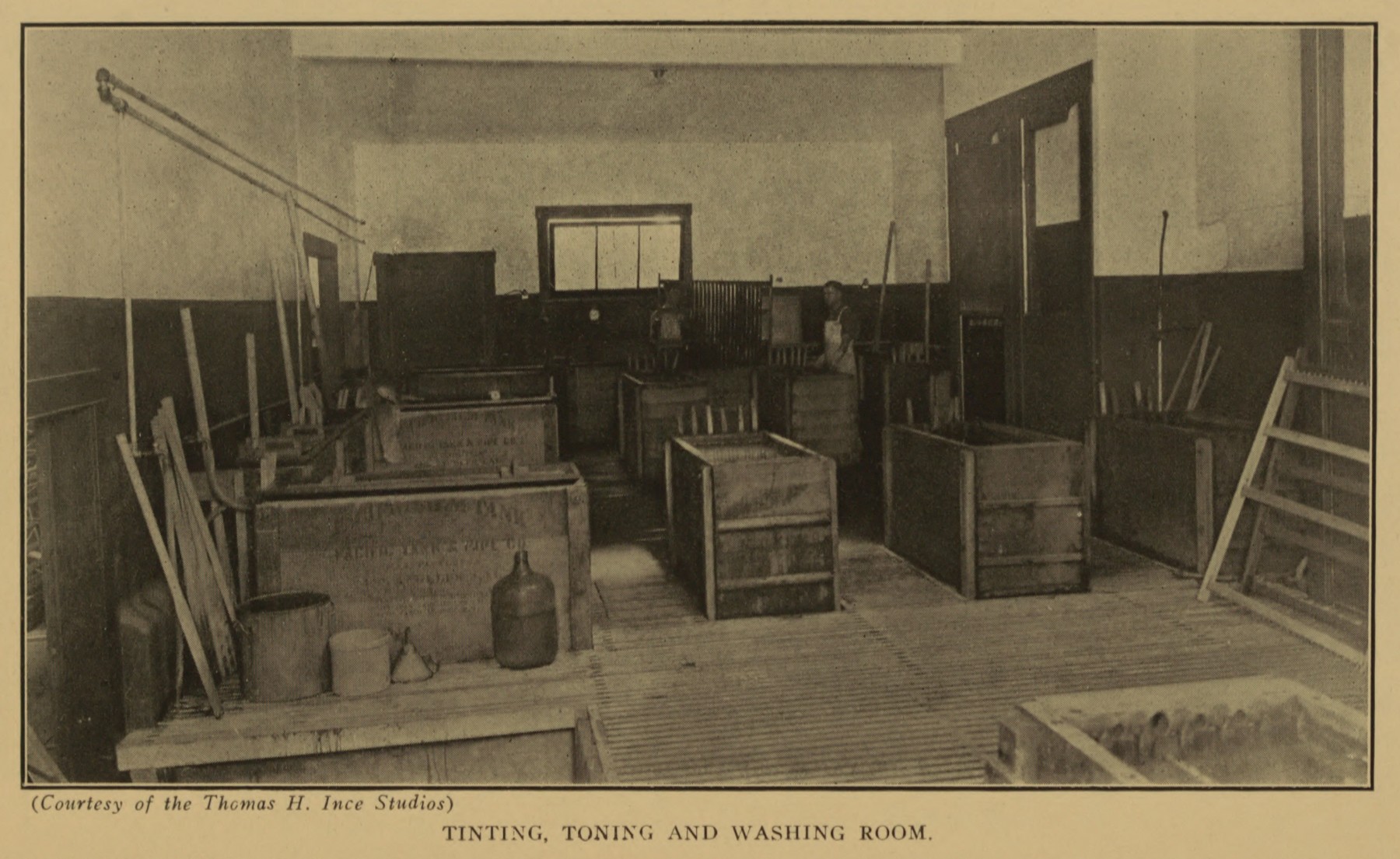
“Tinting, toning and washing room”, Thomas H. Ince Studios.
Gregory, Carl Louis (ed.) (1920). A Condensed Course in Motion Picture Photography. New York: New York Institute of Photography.
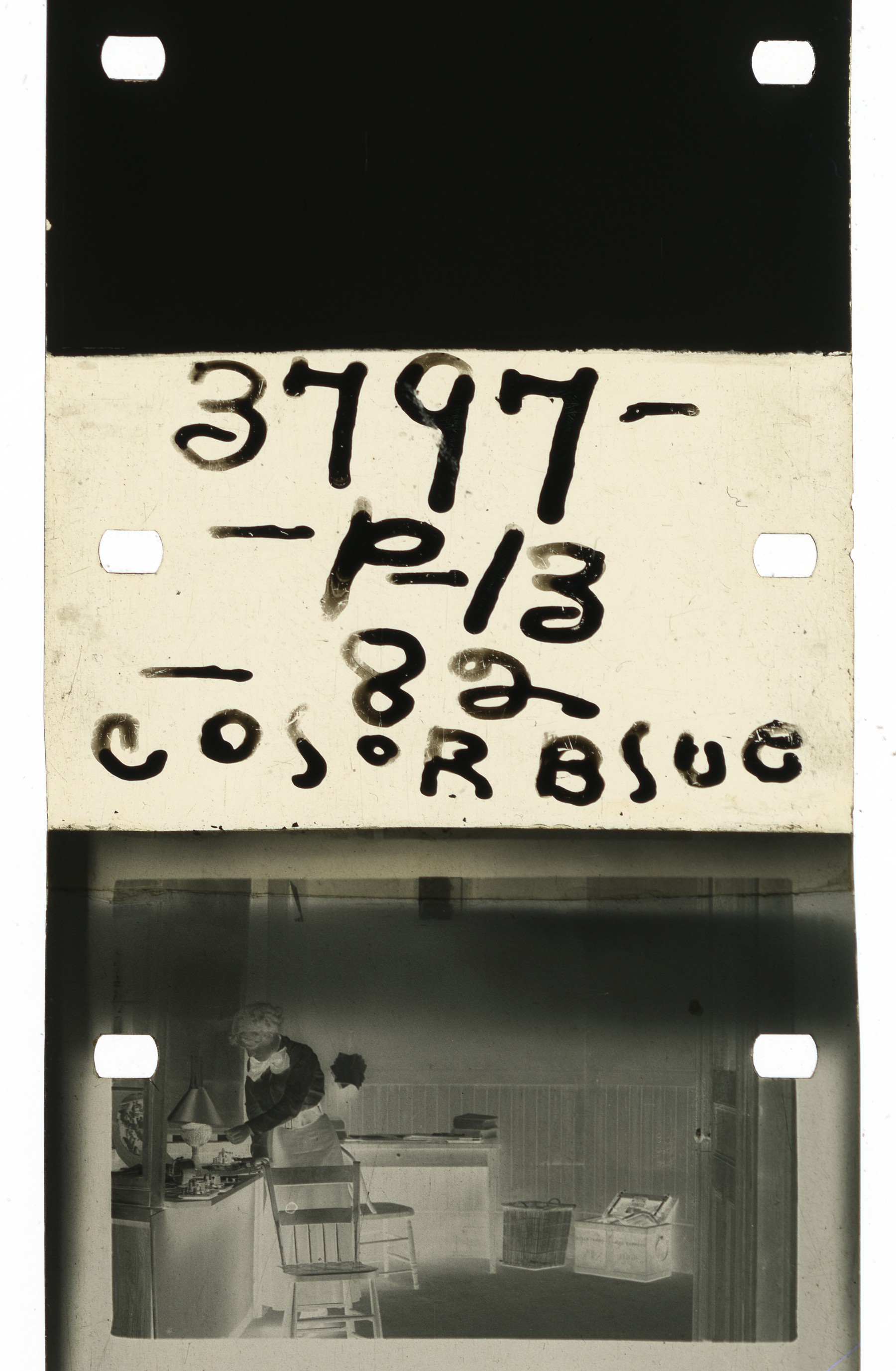
Frames of the negative “slug” with tinting information from The Lonedale Operator (1911), flagging the shift to blue tinting, when the protagonist (Blanche Sweet) turns out the light in the room.
The Museum of Modern Art, New York, NY, United States.
References
Abel, Richard (1987). French Cinema: The First Wave, 1915–1929. Princeton, NJ: Princeton University Press.
Anon. (1911). “Toning and Tinting as an Adjunct to the Picture”. Moving Picture World, 8:11 (March 18): p. 574.
Cherchi Usai, Paolo (2019). Silent Cinema: A Guide to Study, Research and Curatorship (3rd edn). London: BFI/Bloomsbury Publishing.
Elder, R. Bruce (2006). Image and Identity: Reflections on Canadian Film and Culture (Reprint edn). Waterloo, ON: Wilfrid Laurier University Press.
Flueckiger, Barbara (2015). “Color Analysis for the Digital Restoration of Das Cabinet des Dr. Caligari”. Moving Image, 15:1: pp. 22–43.
Gunning, Tom (2003). “Colourful Metaphors: The Attraction of Colour in Early Silent Cinema”. Living Pictures, 2:2: pp. 4–13.
Hertogs, Daan & Nico de Klerk (eds) (1996). “Disorderly Order”: Colours in Silent Film – the 1995 Amsterdam Workshop. Amsterdam: Stichting Nederlands Film Museum.
Didiée, Louis (1926). Le Film Vierge Pathé. Manuel de Développement et de Tirage. Paris: Pathé.
Jenkins, Charles Francis (1898). Animated Pictures. Washington, DC: Press of H. L. McQueen.
L’Abbate, Anthony (2013). “L’aventure des films sonores teintés et virés aux États-Unis” (Trans. Céline Ruivo). 1895. Mille huit cent quatre-vingt-quinze, 71 (December 1): pp. 133–43.
Mazzanti, Nicola (2009). “Colors, Audiences, and (Dis)continuity in the ‘Cinema of the Second Period’”. Film History, 21:1 (Early Colour: Part 1): pp. 67–93.
Read, Paul (2009). “‘Unnatural Colours’: An Introduction to Colouring Techniques in Silent Era Movies”. Film History: An International Journal, 21:1 (Early Colour: Part 1): pp. 9–46.
Street, Sarah & Joshua Yumibe. 2019. Chromatic Modernity: Color, Cinema, and Media of the 1920s. New York: Columbia University Press.
Yumibe, Joshua (2012). Moving Color: Early Film, Mass Culture, Modernism. Techniques of the Moving Image (Series). New Brunswick, NJ: Rutgers University Press.
Patents
None
Followed by
Compare
Related entries
Author
Joshua Yumibe is professor of film studies at Michigan State University. He is the author of Moving Color: Early Film, Mass Culture, Modernism (Rutgers University Press, 2012), co-author, with Giovanna Fossati, Tom Gunning and Jonathon Rosen, of Fantasia of Color in Early Cinema (Amsterdam University Press, 2015), and most recently, with Sarah Street, Chromatic Modernity: Color, Cinema, and Media of the 1920s (Columbia University Press, 2019). He is also an editor of Screen and of the Contemporary Film Directors at the University of Illinois Press.
Research for this entry is drawn primarily from Moving Color: Early Film, Mass Culture, Modernism (2012) and Chromatic Modernity: Color, Cinema, and Media of the 1920s (2019)
Yumibe, Joshua (2024). “Tinting”. In James Layton (ed.), Film Atlas. www.filmatlas.com. Brussels: International Federation of Film Archives / Rochester, NY: George Eastman Museum.