The applied coloring techniques of tinting and toning were often combined during the silent era to create dynamic color effects that enhanced both the highlights and midtones of a print.
Film Explorer
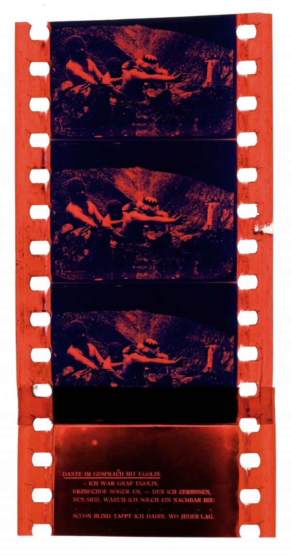
L’inferno (1911). Red tinting was used to color the highlights of this atmospheric image, while darker areas were toned blue.
Davide Turconi Collection, George Eastman Museum, Rochester, NY, United States.
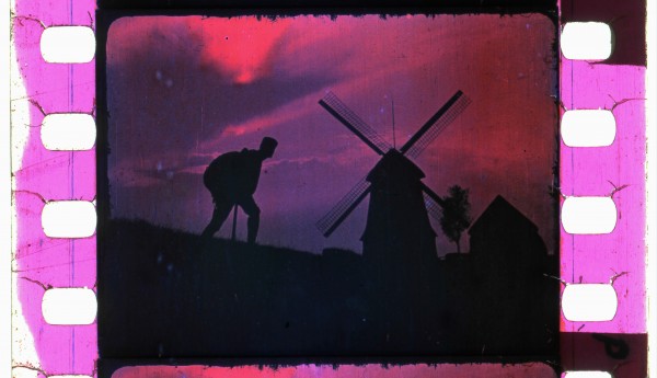
De Molens die juichen en weenen (1912). This film featured multiple different coloring combinations and techniques, including: blue tone and pink tint (as seen in this image); blue tone; red tone; red tint (fire); and stencil color (a red jumper worn by a child contrasts against green stencil-colored grass and hedgerows).
Eye Filmmuseum, Amsterdam, Netherlands.
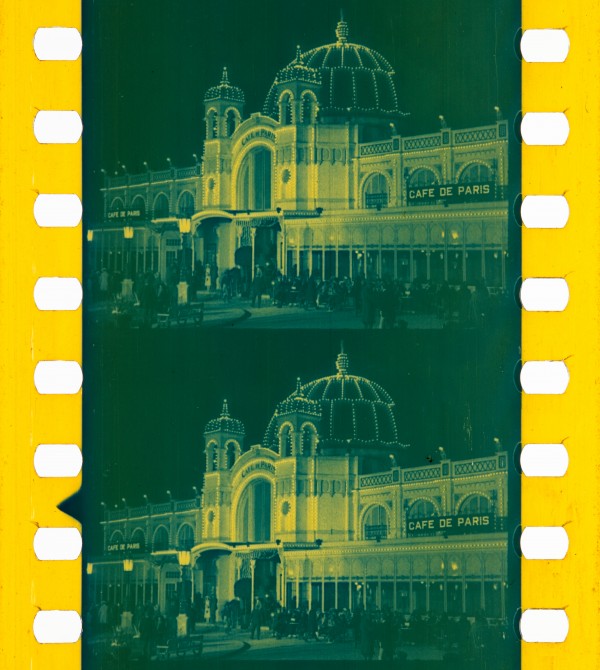
A 1922 episode of Screen Snapshots showed behind-the-scenes footage from the production of Erich von Stroheim’s Foolish Wives (1922). The amber tint/blue tone combination was frequently used in Hollywood features of the 1920s for nighttime exteriors illuminated by artificial light.
National Audio-Visual Conservation Center, Library of Congress, Culpeper, VA, United States. Photograph by Barbara Flueckiger. https://filmcolors.org/galleries/foolish-wives-1922-2/
Identification
Technically, any gauge B/W film could be tinted and toned.
The silver grains of B/W images were converted into insoluble, colored metal salts through a process called toning, which affects the photographically dense (darker) areas of the image. The resulting converted, colored metal salts remain embedded within the emulsion’s gelatin, which could subsequently be evenly stained using water-soluble organic dyes – a process known as tinting. Thus, visually, the dense, or darker, areas exhibit a combination of both colorants’ effects, while the highlights are predominantly the transparent tinting color – this creates a two-color gradient in place of the monochrome density range of the original B/W image. The use of tinting and toning in-tandem could produce a third hue in the midtones (the lighter shadows) where the tinting and toning colors superimpose (for example, a blue-tone and pink-tint combination could render shades of purple in the midtones).
1
Common combinations of tinting and toning include: blue toning with yellow tinting; and blue toning with pink tinting. However, many different color combinations were used.
The majority of films using tint and tone combinations date from the silent era and therefore do not contain soundtracks. However, pre-tinted film stocks, such as Sonochrome, were developed at the end of the 1920s to avoid interference with variable-area and variable-density optical soundtracks used to synchronize image and sound. There is evidence to suggest that a few sound films were released in the 1930s that combined pre-tinted stock with toning.
B/W, either orthochromatic, or panchromatic.
History
The application of dyes to silent B/W film prints emerged c. 1895, an extension of existing chromatic techniques used in still photography (tinted by hand; printed as monochrome images; or, sometimes as the happy result of inadvertent chemical coloration) and from the use of dyes applied to color lantern slides (Bedding, 1909; Timby, 2020). Artisanal methods, such as stencil color and hand-coloring, were labor-intensive as they required close attention to detail within each frame of the film. However, the use of tinting or toning enabled a strip or reel of film to be bath-dyed a single hue, making the process more viable for mass production.
Tinting and toning could be applied separately, or in tandem, to add color to a single piece of film. There were two primary methods for toning: first, the use of a chemical solution to convert, or “bleach”, silver in the images, before a second step converted it into a colored metal compound; second, a mordanting process that made the matrix of silver and gelatin receptive to colored dye. Tints and tones could also be combined with other applied color processes, such as hand-painting or stenciling, to highlight details of the image deemed salient to the meaning of the film (e.g. red to signal a fire in Les Martyrs de l’Inquisition, 1905). Motion Picture Photography stated: “In many cases pleasing effects may be obtained by tinting film which has already been toned. The result is that the clear portions of high lights assume the color of the dye, whilst the shadows and half-tones project a tint intermediate between that of the dye and the toned deposit.” (Gregory, 1927: p.189). Other color combinations seen included brown tone/blue tint and sepia tone/red tint (Cherchi Usai, 1984, plates 33 & 34).
Combinations of tinting and toning brought additional symbolic meaning to film images. For example, the nonfiction film Holland in ijs (1917) used a range of tints, tones and tint/tone combinations: from images of seagulls flying above the ice, to footage of sailboats silhouetted against a winter sky, toned blue and tinted pink. The blue tone and pink tint combination is also seen in the drama De Molens die juichen en weenen (1912): B/W images were interspersed with other color practices, including stenciling (e.g. local color differentiates a red jumper worn by a boy against green-colored grass); tints (e.g. amber tint emblematic of artificial lighting, red tinting symbolic of the heat of a fire); blue tones (signaling night), and blue tone with pink tint (depicting a man standing next to a windmill silhouetted against the dusk sky). The ‘language’ of color seen in De Molens differs from a ‘natural color’ image, which aims to replicate the true gamut of hues perceived in the world around us, in that it seeks to serve the symbolic and poetic realism of the film narrative as the drama culminates (Neale, 1985: p 119). (For further information on color in De Molens see Ruedel, Currò et al. (2013); Fossati, 2009).
De Molens (1912), Holland en ijs (1917), Sur la mer Caspienne (1912) and The Great White Silence (1924) all utilize the blue tone/pink tint combination for the depiction of sunsets, the midnight sun and ice. Notes about aesthetic symbolic “language” are found in film laboratory handbooks and sundry correspondence: “The most successful combination of toning with tinting is in the production of sunset and moonlight effects over water. First tone blue and subsequently tint ‘orange‘ or ‘red.’ The following combinations will cover most cases required: Yellow Brown tone with pink tint. Green and Blue tones with light yellow tint. Blue and violet with almost any delicate shade.” (Gregory, 1927: p. 189). Gregory’s text indicates a use of color that finds its referent in the hues of a sunset and the ethereal effects of moonlight on water. Such color combinations gestured toward nature (sunset, light refracted by ice) and were integral to the imagined world of the film. The combination of tints and tones provided an artistic tool to elevate selected sections of a film: imparting them with greatly enhanced dramatic and sensuous effect (Yumibe, 2012).
However, it is important to note that the selection of tints, tones (and their combination) was influenced both by aesthetic intent and the technical characteristics of the image. For example, although the use of tinting tended to reduce the contrast of the B/W print – producing a less clearly defined image, often assumed to be a fault of the process – this characteristic could be used strategically to create a desirable effect: “The use of delicate tints both removes the contrasting black and white effect and adds a touch of warmth to the black deposit of silver, even in cases where the highlights are insufficiently stained to be noticeable. In many cases the result is equal to that obtained by partial toning” (Eastman Kodak, 1927: p. 197). The Gaumont Company made a similar tactical use of tinting, in combination with toning, when printing Douglas Mawson’s Home of the Blizzard (1916) from a damaged negative. Correspondence between Gaumont and Mawson, a polar explorer, negotiated variations in printing a lighter, or darker image with different saturations of tinting and toning to accommodate the cinematographer Frank Hurley’s deteriorated, yet irreplaceable, film footage of the Antarctic. In this instance the combination of blue tone and a light red tint for “transparent and semi-transparent ice” was recommended as a way to blend the shots with the general color scheme of the film while presenting the best-quality image possible: the color contrast and intermediate colors (blue, pinks, purples) were intended to render the finer details of the ice more visible. Yet the choice of colors often reflected culturally received and specific notions of the symbolism and meaning of certain colors. For example, in The Great White Silence (1924), Herbert G Ponting’s edit of his film footage of Robert Falcon Scott’s fatal 1910–13 South Pole expedition, a combination of a green tone and sepia tint accompanies wildlife topics (such as scenes of seals – relying on a color effect that might evoke the natural world (e.g. green fields and trees in temperate sunlight) in an environment other than the frigid Antarctic. The green-sepia combination symbolized nature in a landscape more familiar to cinema audiences in New Zealand and the British Isles, where the film was largely viewed. The color coding of meaning was aligned to the cultural expectations of the intended audience. Guidance on the use of color combination for specific topics was provided in the Eastman Tinting and Toning catalogue (1927).
A complicating factor (as well as a source of intrigue) in researching applied-color processes in silent film, is the mutability of the subject matter: multiple prints of a single film title could be produced and distributed using different color tints, tones, and tint and tone schemes, for a variety of reasons. For example, in 1915, work on the Home of the Blizzard used an amber stain, in place of a previously specified sulfide-brown tone, because the Gaumont laboratory had “found some difficulty in toning on account of warmth of solution in the summer” (Gaumont Papers, 1912–15). Tinting could also be susceptible to fading following faulty processing in the laboratory, or substandard storage conditions, either of which can adversely affect both the film substrate as well as the coloration chemistry itself. Fading can completely alter the color balance and effect of tints and tones. For example, the intensity of blue tones can fade over time to become barely perceptible, leaving the appearance of a plain, untoned B/W image; green tones can fade to browns (Fossati, 2009: Fig. 6 & Fig. 7).
In addition, many film positives have been damaged, re-edited and lost – leaving incomplete narratives and B/W negatives as the only primary sources – further complicating archival research, and rendering restoration projects somewhat challenging.
The variety of chemicals used in tint/toning baths, the large number of dye manufacturers and film laboratories, as well as diverse approaches to allocating and recording the use of applied color processes, all mean that it can be challenging to reverse-engineer the combination of tinting and toning used to achieve the effects found in a single frame. For example, British trade papers, such as the Kinematograph Weekly, The Bioscope, as well as newstand paper reviews, often simply use the phrase “tinting and toning” for whole films in which distinct processes were applied to separate sections of the footage. Such reviews tend to describe color in greater detail where its use was considered to be of particular interest, either for its “unnatural nature” (Kinematograph Weekly, 1910b) or for its subtle effects. There are a few exceptions, in which the effect of combined colors is noted. For example, a review of Pathé Frères films Enchanted Glasses (1907) and The Highwaymen (1907) noted “some remarkable effects of tinting and toning which are introduced in the course of the subject, and which in parts give the closest approximation to natural tints, which we imagined would be impossible to get without colour photography. By the use of two colours for tinting, which acting together seem to produce a third Pathé have in this subject achieved really fine effects” (Kinematograph Weekly, 1907). The surviving prints of the trick film The Enchanted Glasses (Les Verres Enchantés) vary: sometimes B/W, or with stenciled frames, or toned.
Similarly, advertisements and newspaper reviews of The Temple of Venus (1923) describe a silent film featuring “marvellous examples of underwater colour photography” (Fleetwood Chronicle, 1924); and “deep sea photography by a new process; rare colour effects; and striking costumes which were specially designed for the feminine players” (Nuneaton Chronicle, 1924). However, the cutting continuity script indicates B/W film images that were colored separately as sepia toning and green tinting. The script details an elaborate color scheme of tones, tint and tone combined, double-toning, and an instruction to “Double Tone Wash Blue”. The film, a silent fantasy romance which juxtaposes modern and mythological sequences, studio scenes and nature studies (seals, nesting birds) on location in Santa Cruz, used a variety of applied colors for spectacular and sensuous effect to underscore the visual and spatial logic of the plot. For example, modern domestic interiors and cultivated gardens predominantly used single tints (yellow, pink), but also tint and tone combinations (sepia/pink, sepia/”Old Rose”, and those which might be a double tint or tint and tone, such as “Lavender” and “Old Rose Tint”), whilst the mythological scenes filmed on location in woodlands, coast and sea use single tints (sepia, green, or blue) and tint tone combinations (blue-grey and violet water; blue-grey and yellow). The script also indicates that nature scenes (nesting birds, seals, underwater) were to be tinted sepia or green. The complementary color schemes distinguish different worlds (modern/domestic and mythological/natural) and locations (interior/exterior). Combinations of supplementary colors, such as a blue tone and yellow tint for water in sunlight which produces a greenish coloration in the mid-toned areas of the image, underscored the oceanic theme. The script indicates the use of combined tint and tone in the final sequence which reinforced color continuity: the first shot, which depicted clouds in a “Blue Grey and Blue”, was immediately followed by a combination of “Blue Grey and Old Rose” for a scene of sea and clouds; and then images of Venus, Cupid and the intertitle “Romance Lives” in a “Sepia and Old Rose tint”; before a final transition to a “Sepia and Yellow” shot of two people in a boat. The pattern of single and combined colors creates a continuity within the sequence, as each subsequent section retains one of the two colors used in the previous shot.
The cutting and continuity script for the seven-reel film, He Who Gets Slapped (1924) was based on a play by Leonid Andreyev: a scientist attends an Academy of the Sciences to present his research, where a rival, who has plagiarized his work, slaps him. Humiliated, the scientist becomes a circus clown under the name ‘He who gets slapped’ to relive his despair for the amusement of the crowd. The film plot is structured by shifts in color, signaling the start of new scene or location: a dramatic turning point in the plot intercuts shots of the clown alone in the circus spotlight tinted “light amber”, with images depicting his love-interest with his rival in a street scene, colored with a blue tone and amber tint. This practice establishes a spatial logic that emphasizes emotional and psychological tension.
Whilst the cutting continuity scripts of the 1920s often outlined complicated color schemes, using generic names (blue, sepia, green) as well as those specific to particular manufacturer’s handbooks (“Old Rose”), the practical realities of film laboratory work frequently influenced the final coloration – affected by factors such as chemical availability, dye specificity, and ambient temperature (see comments on Home of the Blizzard above). To accurately reconstruct the applied colors of silent films, researchers must rely on several key resources, which include film laboratory handbooks, interdepartmental correspondence and interarchival research. Tint and Tone catalogues, such as those from Agfa, Gevaert and Pathé, include sample film frames that depict combined tinting and toning. Surviving negatives and prints may be B/W regardless of instructions for coloring, as single film titles could be distributed in a variety of prints – with different color schemes and no tint/tone at all (Mazzanti, 2009). Some films are only preserved as a B/W copy. For the 2010 color restoration of The Great White Silence (1924), the BFI National Archive consulted prints from La Cinémathèque de Toulouse, France, the EYE Filmmuseum, Netherlands, a Pathé Tint and Tone catalogue, as well as instructions for coloring that had been written on blank sections of film and spliced into a print of the film prior to its acquisition by the archive (Watkins, 2013). Each print of Silence differed, but included instructions for blue tone/yellow tint /and blue tone/pink tint.
The demise of combined tint and tone has been linked to the development of Kodak’s pre-tinted film stock, Sonochrome and the emergence of synchronized sound. Carl Louis Gregory did note some issues associated with the use of tint/tone on optical variable-density soundtracks, but considered them surmountable (Gregory, 1927).
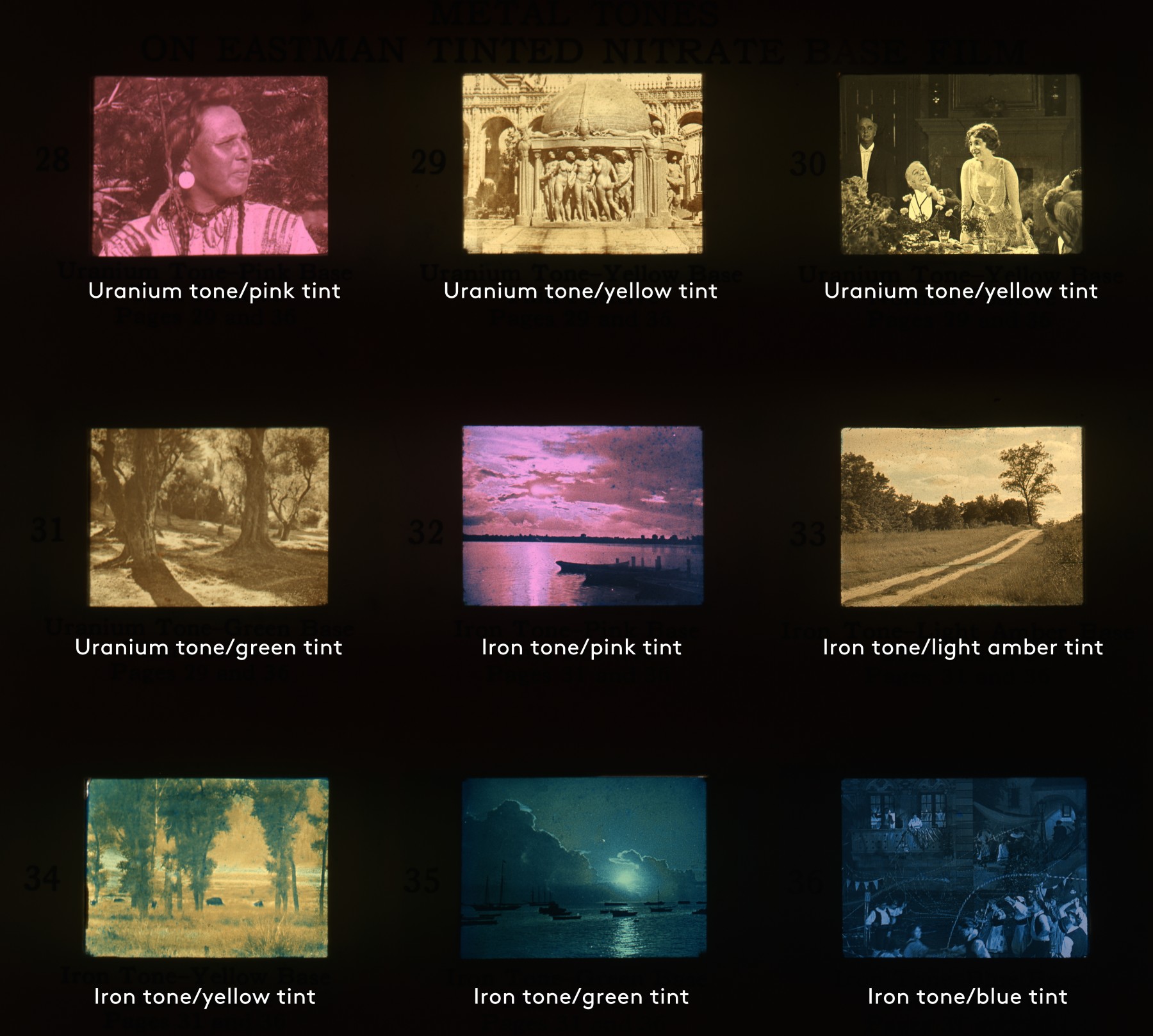
Illustrative examples of color effects from Tinting and Toning of Eastman Positive Motion Picture Film (4th edition), 1927.
George Eastman Museum, Rochester, NY, United States.
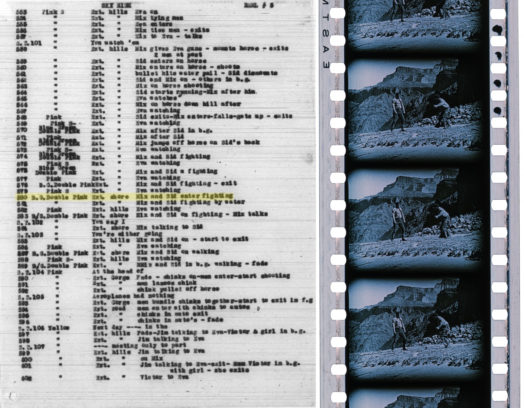
Left: The Sky High (1922) cutting continuity script lists the tinting and toning colors for each shot in the second column. Right: Shot 580 as it appears today in the only surviving nitrate print. The color instructions reveal that this shot was originally toned “B.G.” (blue-grey) and tinted “Double Pink”. Sadly, the heavy pink tint has mostly faded from the print today.
Left: Motion Picture Copyright Descriptions Collection, Motion Picture, Broadcasting, and Recorded Sound Division, Library of Congress, Washington, D.C., United States. https://hdl.loc.gov/loc.mbrsmi/cdmmi.s1229l17480. Right: UCLA Film & Television Archive, Santa Clarita, CA, United States. Frame scan by Brian Belak.
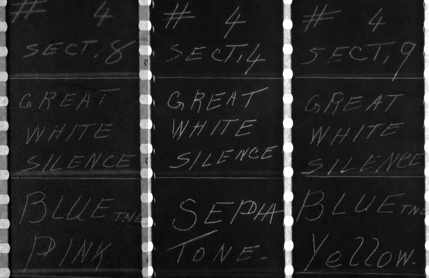
Tinting and toning slugs for Herbert Ponting’s The Great White Silence (1924).
BFI National Archive, Berkhamsted, United Kingdom.
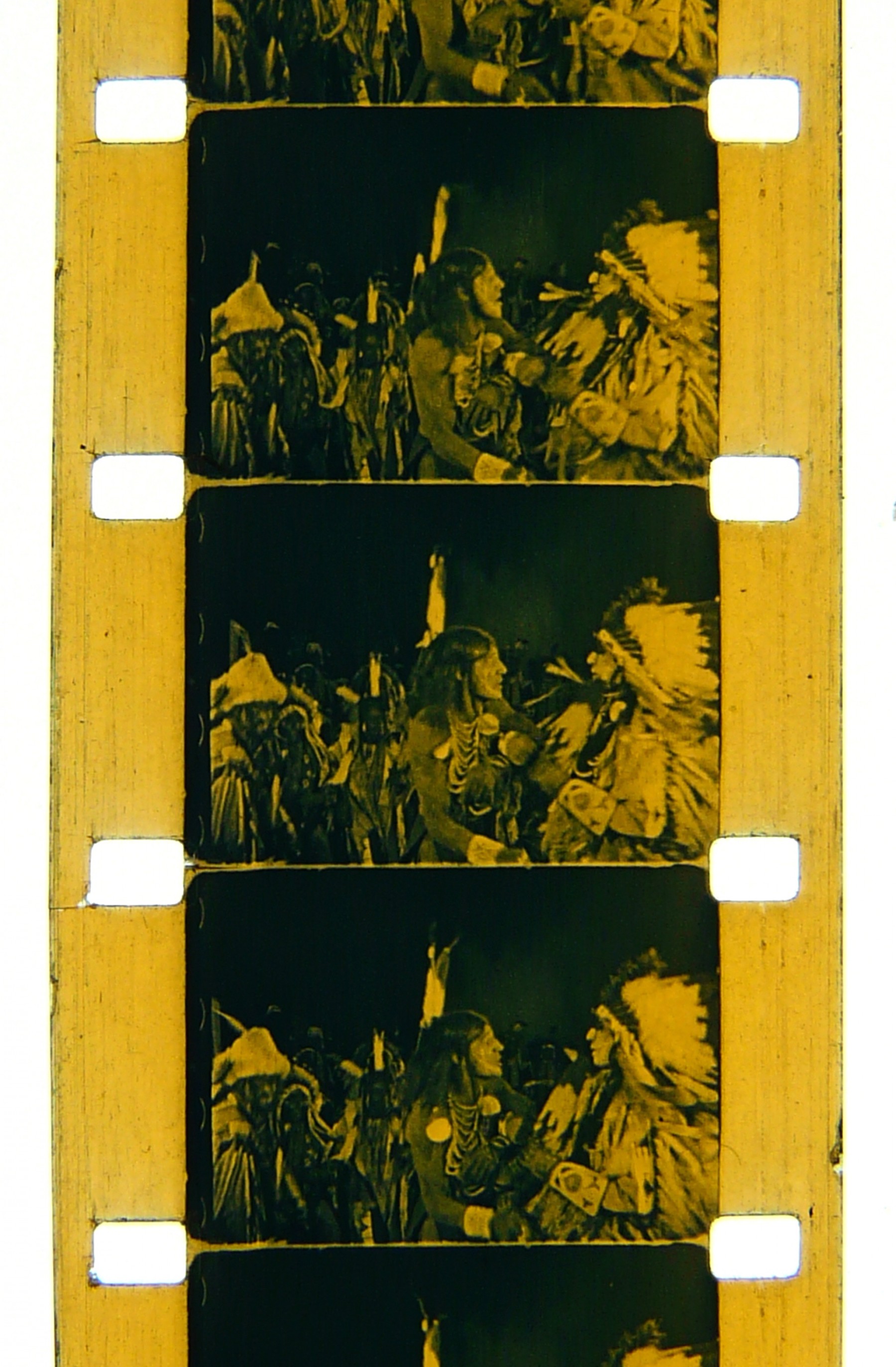
Tinting and toning practices were not limited to 35mm releases. Some 16mm Kodascope prints also featured these effects, although surviving prints are rare. This French Kodascope print of the US Western The Devil Horse (Le Cheval Demon) (1926) is toned blue and tinted amber during a short, narratively decisive sequence. The blue-tone/amber-tint combination was often used to signal external night scenes lit by artificial light sources, such as campfires or flares.
Benoît Carpentier, Cinémathèque16, Paris, France.
Selected Filmography
French 16mm Kodascope prints contain blue-tone/amber-tint for nighttime scenes lit by diagetic artificial light.
French 16mm Kodascope prints contain blue-tone/amber-tint for nighttime scenes lit by diagetic artificial light.
Ponting’s 1924 edit of his 1910–11 film footage of Captain R. F. Scott’s ill-fated journey to the South Pole. A combination of a green tone and sepia tint was used for images of wildlife; blue-tone/pink-tint and blue-tone/yellow-tint combinations were also used.
Ponting’s 1924 edit of his 1910–11 film footage of Captain R. F. Scott’s ill-fated journey to the South Pole. A combination of a green tone and sepia tint was used for images of wildlife; blue-tone/pink-tint and blue-tone/yellow-tint combinations were also used.
Used a range of tints, tones, and tint/tones combined, including: blue-toned images of seagulls flying above the ice; and a section with sailboats silhouetted against a winter sky, toned blue and tinted pink. Print survives at Eye Filmmuseum, Netherlands.
Used a range of tints, tones, and tint/tones combined, including: blue-toned images of seagulls flying above the ice; and a section with sailboats silhouetted against a winter sky, toned blue and tinted pink. Print survives at Eye Filmmuseum, Netherlands.
Film footage from Captain Douglas Mawson’s Australian Antarctic Expedition 1911–14. Used blue tone and a light-red tint combinations for shots of ice.
Film footage from Captain Douglas Mawson’s Australian Antarctic Expedition 1911–14. Used blue tone and a light-red tint combinations for shots of ice.
Includes a sequence toned blue with a red tint. http://www.cinetecadelfriuli.org/progettoturconi/title.php?TITLE_NUMBER=53#clip
Includes a sequence toned blue with a red tint. http://www.cinetecadelfriuli.org/progettoturconi/title.php?TITLE_NUMBER=53#clip
This film featured multiple different coloring combinations and techniques, including: blue tone and pink tint; blue tone; red tone; red tint (fire); and stencil color (a red jumper worn by a child contrasted against the green stencil-colored vegetation). Print survives at Eye Filmmuseum, Netherlands.
This film featured multiple different coloring combinations and techniques, including: blue tone and pink tint; blue tone; red tone; red tint (fire); and stencil color (a red jumper worn by a child contrasted against the green stencil-colored vegetation). Print survives at Eye Filmmuseum, Netherlands.
Includes a death scene tinted purple/violet and toned pink. http://www.cinetecadelfriuli.org/progettoturconi/clip.php?CLIP_NUMBER=10263
Includes a death scene tinted purple/violet and toned pink. http://www.cinetecadelfriuli.org/progettoturconi/clip.php?CLIP_NUMBER=10263
Uses a blue tone and pink tint. Print survives in the Desmet Collection, Eye Filmmuseum, Netherlands.
Uses a blue tone and pink tint. Print survives in the Desmet Collection, Eye Filmmuseum, Netherlands.
Featured an elaborate color scheme utilizing tints, tones, tint and tone combined, and double-toning.
Featured an elaborate color scheme utilizing tints, tones, tint and tone combined, and double-toning.
Technology
[For more information on Tinting and Toning used in isolation, please consult those separate Film Atlas entries.]
Tinting required the submersion of a film strip in a dye bath to leave a veil of color across the entirety of the film, but was most visible in the lighter areas of the image. Toning was a chemical process that colored the darker elements of the image where the silver was densest. There were two primary methods of toning: first, the use of a chemical solution to convert, or “bleach”, silver salts, before a secondary reaction turned them into a colored metal compound (e.g. iron produced blue-green tones); second, a mordanting process could be employed to render the silver areas of the image receptive to a colored dye. Tinting and toning in combination therefore produced more dynamic color effects whereby different colors could be applied respectively to the highlights and the shadows within an image.
Manufacturers of dyes used for tinting included Hoechst, DuPont, and the National Aniline & Chemical Company Inc. Each company allocated different commercial names to their range of dyes. For example, “Pontacyl Ruby G” (DuPont) or “Chromotrop FB” (Hoescht) were used in the Eastman Kodak Research Laboratory’s formula for “Cine Red”. The Eastman Kodak Research Laboratory Handbook on Tinting and Toning, published in 1918, notes the difficulties in obtaining dyes from European companies toward the end of World War I – availability was restricted by political divisions and the denuded state of the economies of the region. The chemical “recipes” and timings used for dyes used in tinting, along with details of the chemical baths used for toning, are detailed in Eastman Kodak handbooks, as well as those published by Agfa (Agfa Kine, 1925) and Pathé (Pathe-Cinema, 1926).
The issues encountered in using combined tinting and toning included: managing variations in the concentration of dye solution and the duration that the film strip was submerged, which affected the intensity of the color achieved; the formation of sludge, or froth, from an incorrectly stirred dye bath, which could result in a mottled image; maintaining a steady temperature of the dye or chemical bath; controlling the ambient room temperature; and avoiding impurities in the chemical bath that might lead to inconsistent results (such as color “bleeding”). Toned film could become brittle, while tinted films were susceptible to fading (iron tones could also fade to yellow if the film was improperly washed). The inconsistent qualities of supplied dyes led the Eastman Kodak Research Laboratory to advise the testing of color combinations using an artificial light source, as, for example, a “Cine Blue” tint would take on a more reddish hue when viewed by artificial light compared to its appearance in daylight, which in turn would alter its interaction with a colored tone in projection.
References
Agfa Kine (1925). Agfa Kine-Handbuch. Aktien-Gesellschaft für Anilin-Fabrikation, Berlin: Agfa Kine.
Bedding, Thomas (1909). “Practical Moving-Picture Making. Tinting and Toning”. The Bioscope, 157 (October): pp. 23–5.
Bexhill-On-Sea Observer (1924). “Amusements, Pictures, Plays and Music”. Bexhill-On-Sea Observer (June 21, 1924).
Cherchi Usai, Paolo (1994). Burning Passions, An Introduction to the Study of Silent Cinema. London: BFI Publishing.
Didiée, L. (1926). Le Film vierge Pathé. Manuel de développement et de tirage. Pathé, Paris.
Eastman Kodak Company (1918). Tinting and Toning of Eastman Positive Motion Picture Film (2nd Edition), pp. 5–28. Rochester, NY: Eastman Kodak Company. (3rd edition [1922]; 4th edition [1927]).
Fleetwood Chronical (1924). Advertisement for The Temple of Venus. Fleetwood Chronicle (March 28): p. 6.
Flueckiger, Barbara (2015). “Color Analysis for the Digital Restoration of Das Cabinet des Dr. Caligari”. The Moving Image, 15:1: pp. 22–43.
Flueckiger, Barbara, Franziska Heller, Claudy Op den Kamp & David Pfluger (2016). “‘Digital Desmet’: Translating Early Applied Colors”. The Moving Image, 16:1: pp. 106–124.
Fossati, Giovanna (2009). From Grain to Pixel: The Archival Life of Film in Translation. Amsterdam: Amsterdam University Press.
Gregory, Lewis (1927). “Tinting and Toning Motion Picture Films”. In Motion Picture Photography, pp. 177–98. New York: Falk Publishing.
Kinematograph Weekly (1907). “Latest Productions”. Kinematograph Weekly, 1: 19 (September 19): p. 317.
Kinematograph Weekly (1910a). “Unnatural Colour”. Kinematograph Weekly, 177: 7 (September 29): p. 1347.
Kinematograph Weekly (1910b). “Notes by the Way”. Kinematograph Weekly, 7:176 (September 22): p. 1286
Mawson, Douglas (1915). Correspondence from Douglas Mawson to Gaumont Co. Ltd. London. August 19, 1912. AAE169. South Australian Museum, Adelaide.
Mazzanti, Nicola (2009). “Colours, audiences, and (dis)continuity in the ‘cinema of the second period”. Film History, 21:1: pp. 67–93.
Neale, Steve (1985). “Tinting and Toning”. In Cinema and Technology: Images, Sound, Colour, pp 117–20. Bloomington: Indiana University Press.
Nuneaton Chronicle (1924). “How the Temple of Venus was Filmed”. Nuneaton Chronicle (Warwickshire) (March 7): p. 6.
Pathe-Cinema (1926). Le Film vierge Pathé. Manuel de développement et de tirage. Paris: Pathe-Cinema.
Read, Paul (2009). “‘Unnatural Colours’: an Introduction to Colouring Techniques in Silent Era Movies”. Film History, 21:1: pp. 7–46.
Ruedel, Ulrich, Daniella Currò & Claudy op den Kamp (2013). “A more accurate preservation of color, heritage research and the film restoration laboratory”. In Color and the Moving Image: History Theory Aesthetics Archive, Simon Brown, Sarah Street & Liz Watkins (eds), pp. 219–29. New York: Routledge.
Timby, Kim (2020). “The Colors of Black-and-White Photography”. In The Colors of Photography, Bettina Gockel (ed.), pp. 201–31. Boston, MA: De Gruyter.
Watkins, Liz (2013). “Herbert Ponting’s Materials and Texts”. In Color and the Moving Image: History Theory Aesthetics Archive, Simon Brown, Sarah Street & Liz Watkins (eds), pp. 322–35. New York: Routledge.
Yumibe, Joshua (2012). Moving Color, Early Color, Mass Film and Modernism. New Brunswick, New Jersey and London: Rutgers University Press.
Patents
Preceded by
Compare
Related entries
Author
Dr Liz Watkins teaches the theories, technologies and materialities of color in photographic and film archives at the University of Leeds. She has held research fellowships at the University of Bristol, University of Leeds, National Maritime Museum in Greenwich, Harry Ransom Research Center at the University of Texas at Austin, and the University of Oxford. Her publications include journal articles in Screen, Journal for Cultural Research and photographies. She is the co-editor of Color and the Moving Image, British Colour Cinema and Gesture and Film: Signaling New Critical Perspectives.
Thanks to James Layton and Crystal Kui (Film Atlas), Vicky Jackson (University of Bristol), Mark Pharoah (South Australian Museum, Adelaide), Benoît Carpentier (Cinémathèque16), and the insightful blind peer reviewers.
Watkins, Liz (2024). “Tinting and Toning (combined)”. In James Layton (ed.), Film Atlas. www.filmatlas.com. Brussels: International Federation of Film Archives / Rochester, NY: George Eastman Museum.